
I like the fact that as soon as you go on their site, you see a wide selection of the work that they have done...which in their case is impressive because its all stuff that is noticeable because its been on tv etc.
It is quite simple...but it works so well that Their work makes it impressive, which is what it should do really.
 Serge Seidlitz;
This is his new site; I went on it when it was first launched and it didn't work well at all, but now its sorted I think its great.
Similar to studio aka, you see a selection of his work as soon as you get on the site...as well as a brief introduction to who he is and a news section...its all really there for you in the first place.
You don't need to spend ages navigatin to find something.

Mike Perry;
This is actually a like and dislike...I dislike it because there is So much on it and he does sometimes use a horizontal scroll bar. But on the other hand, he has a downloadable PDF portfolio, which is useful - a link to his twitter, which makes it more personal - a shop, for that bit more income and it does reflect his work.
The more I talk about it though...the more I'm not sure about it.

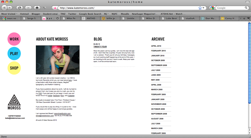
Kate Moross;
Its simple, very well organised and easy to navigate. Sometimes putting an image of yourself up can be quite cheesy but in this instance, I think seeing an image of her sets a premise straight away for her work is like and shows a 'friendly' side.
One thing I would say is that I wish there were more images of her work in the first place rather than having to click on lots of links/words to find an image.
Billie Jean;
Visually engaging, fun and funny :) and it reflects her work, 's'all good'


No comments:
Post a Comment