
Flickr
I've had this Flickr account for a while...but haven't really spent much time on it because it takes a while to upload on my laptop....but over the summer I want to make it a lot more substantial and put a lot more of my recent work up on to it.
Although the site kind of annoys me with the navigation, I think its a good way to get my work out there and have a basic online presence.

Although the site kind of annoys me with the navigation, I think its a good way to get my work out there and have a basic online presence.

Online magazines/sources
Over the summer I intend to spend more time on these sites, by either submitting work or finding contacts...specifically the Creative handbook as its linked to Creative review...which is obviously pretty high profile! (By pretty...I mean very)


Illustration agents
As I came to the conclusion that I, Ideally want to go freelance...I don't think asking to go work in a design studio for a week would be particularly benifical for me this summer because I wouldn't be in the right frame of mind.
Maybe in the future...but not right now.
Taking this into account, one of the things I will be doing over the summer is contacting illustration agents...in London, manchester etc. and hopefully starting a conversation with them.
A few I have identified so far that I will contact are below;
CIA - Central Illustration Agency.
They have a specifically typography/type as image section which I feel my work would fit into.

 Debut Art
This agency represents Serge Seidlitz, whose work I really like at the moment...this being the main reason I want to look more into them and contact them.

 Folio;
I haven't really spend a huge time looking at these...but they look professional and I like the artists/work that they represent.
 Heart;
In addition to liking the work that these represent, another selling point is the fact that they have an office in London...and an office in New York; my favourite place.

Lemonade;
For some reason, these don't really look as professional as the others but I will look more into them to see if they're worth contacting/if they're successful.
 NB -
NB -
Once again, the thing that drew me to these were the fact that they have a typography section.


Good Illustration/Thorogood;
I found these by searcing for Thoroughgood/Thorogood so I don't know if they've changed their name...or this is another one, but either way the work that they represent is great and they represent a Lot of people which I think is a selling point.


Maybe in the future...but not right now.
Taking this into account, one of the things I will be doing over the summer is contacting illustration agents...in London, manchester etc. and hopefully starting a conversation with them.
A few I have identified so far that I will contact are below;
CIA - Central Illustration Agency.
They have a specifically typography/type as image section which I feel my work would fit into.

 Debut Art
This agency represents Serge Seidlitz, whose work I really like at the moment...this being the main reason I want to look more into them and contact them.

 Folio;
I haven't really spend a huge time looking at these...but they look professional and I like the artists/work that they represent.
 Heart;
In addition to liking the work that these represent, another selling point is the fact that they have an office in London...and an office in New York; my favourite place.

Lemonade;
For some reason, these don't really look as professional as the others but I will look more into them to see if they're worth contacting/if they're successful.
 NB -
NB -Once again, the thing that drew me to these were the fact that they have a typography section.


Good Illustration/Thorogood;
I found these by searcing for Thoroughgood/Thorogood so I don't know if they've changed their name...or this is another one, but either way the work that they represent is great and they represent a Lot of people which I think is a selling point.


How to be a graphic designer without losing your soul
I wasn't really sure what i'd 'get' from this book at first but it actually proved really helpful.
My favourite section was the 'being freelance' one.
Before I read it, I thought I was just being stubborn and childish for saying that I don't really want to work with others on a daily basis i.e. share a room with them.
But in this section it mentions that you can characterize a freelance designer as two types of people...the second being 'a creative loner' who can't really adjust well to design studio and an interview with Kim Hiorthoy states that they prefer to work on their own because they 'Often change my mind at the very end of project, not having to argue or defend this decision to someone else is an advantage'.
I dont like arguing with people but I am very opinionated about My work and I know what I want to do....so I just want to do it, instead of having to spend days thinking of how we can incorporate what they want aswell.
I would love to do a distance collaborative piece lol. Where I do my bit...then send it off to them to do theirs of vice verse.
 I would also love a studio like this; obviously I would need a chair and desk, but I will pretend thats 'off screen'...but to have room and walls filled with inspirational work would be great.
Websites I do like
Studio AKA;
I like the fact that as soon as you go on their site, you see a wide selection of the work that they have done...which in their case is impressive because its all stuff that is noticeable because its been on tv etc.
It is quite simple...but it works so well that Their work makes it impressive, which is what it should do really.
 Serge Seidlitz;
This is his new site; I went on it when it was first launched and it didn't work well at all, but now its sorted I think its great.
Similar to studio aka, you see a selection of his work as soon as you get on the site...as well as a brief introduction to who he is and a news section...its all really there for you in the first place.
You don't need to spend ages navigatin to find something.

Mike Perry;
This is actually a like and dislike...I dislike it because there is So much on it and he does sometimes use a horizontal scroll bar. But on the other hand, he has a downloadable PDF portfolio, which is useful - a link to his twitter, which makes it more personal - a shop, for that bit more income and it does reflect his work.
The more I talk about it though...the more I'm not sure about it.

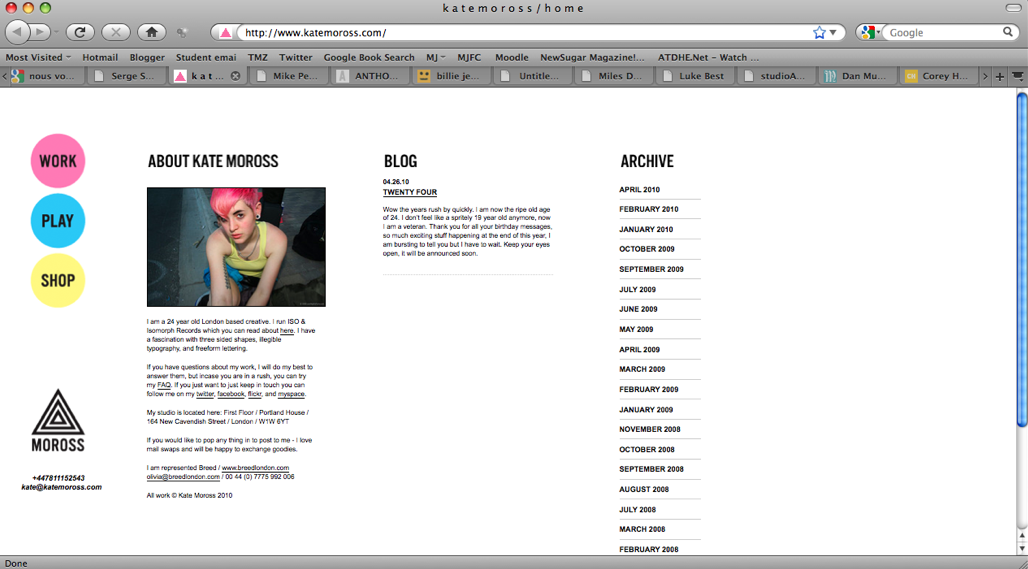
Kate Moross;
Its simple, very well organised and easy to navigate. Sometimes putting an image of yourself up can be quite cheesy but in this instance, I think seeing an image of her sets a premise straight away for her work is like and shows a 'friendly' side.
One thing I would say is that I wish there were more images of her work in the first place rather than having to click on lots of links/words to find an image.

Billie Jean;
Visually engaging, fun and funny :) and it reflects her work, 's'all good'


I like the fact that as soon as you go on their site, you see a wide selection of the work that they have done...which in their case is impressive because its all stuff that is noticeable because its been on tv etc.
It is quite simple...but it works so well that Their work makes it impressive, which is what it should do really.
 Serge Seidlitz;
This is his new site; I went on it when it was first launched and it didn't work well at all, but now its sorted I think its great.
Similar to studio aka, you see a selection of his work as soon as you get on the site...as well as a brief introduction to who he is and a news section...its all really there for you in the first place.
You don't need to spend ages navigatin to find something.

Mike Perry;
This is actually a like and dislike...I dislike it because there is So much on it and he does sometimes use a horizontal scroll bar. But on the other hand, he has a downloadable PDF portfolio, which is useful - a link to his twitter, which makes it more personal - a shop, for that bit more income and it does reflect his work.
The more I talk about it though...the more I'm not sure about it.

Kate Moross;
Its simple, very well organised and easy to navigate. Sometimes putting an image of yourself up can be quite cheesy but in this instance, I think seeing an image of her sets a premise straight away for her work is like and shows a 'friendly' side.
One thing I would say is that I wish there were more images of her work in the first place rather than having to click on lots of links/words to find an image.
Billie Jean;
Visually engaging, fun and funny :) and it reflects her work, 's'all good'


Websites that are...alright
Once again, I like the work on the sites...but I'm not totally inspired by them...but I don't Dislike them totally.
Anthony Burrill;
I actually quite like the site but I just think it can sometimes take a long time to find something.
 Dan mumford;
Again, the site is quite nice and it does navigate quite well but considering how visual/illustrative Mumfords work is...the site looks so formal...to the extent that His work, looks like an advert for another site.
 Serge Seidlitz;
This is actually his old site...and his new one is a site that I do like.
This one looks really nice and visual but it just had So much going on, you didn't really know where to click or what it would take you to.

Websites I don't like
These are a few of the sites that I've found when looking at some of my favourite artists or finding new ones...and I don't think the sites really reflect the quality of work. Some of them are too overcomplicated or some of them just...don't look very nice.
Alex Pardee;
I really like this artist; I discovered him a few year ago from some album artwork that he did.
Although I like the idea of his home page leading you to either his blog or his work...the type is just so bland compared to the illustration.
Then when you choose art, theres are a lot of empty space...but the texture of the background doesn't really 'do anything' for it and the thumbnails of his work are so small you don't really know what you're clicking on.

 Corey Holms;
I suppose this works for a layout based designer, I do quite like the simple colour scheme and it is quite functional/well navigated but in terms of being inspiring for me in particular...it isn't. I find it quite bland and boring. Too many words.

Jon Burgerman;
He is so well known and the intro animation to his site for his 'inkstrumental' thing at the apple store is great...but then you get to the site and its quite...boring. I don't particularly like the header of the page, I don't think it reflects him as well as some of his work could and then the whole layour is just quite...blogger like. I wouldn't say it inspires me.
 Luke Best and Miles Donovan;
These two artists aren't linked...apart from the layout of their websites. I predict that mine will be quite simple, but I hope it will be simple in a good working way...whereas this kind of confuses me - I just don't really like the idea of the horizontal scroll bar...so all the work is on a timeline but, it just confused me because you don't expect to scroll along horizontally...so I, at first, assumed the site wasn't working.


The boy fitz hammond;
The site is quite simple but I don't actually know if its a serious graphic designer/illustrator...or its just a well promoted/high quality hobbie.
The thumbnails, once again, are too small so you don't really know what you're going to see when you click on it.


The Boy Fitz Hammond
Illustrations of celebrities with witty comment about them at the side; I wish I could just do that for the rest of my life.

There was huge amount of work on the site but thankfully when I opened it, this popped up...
 ...which is a really great example of type as image.

There was huge amount of work on the site but thankfully when I opened it, this popped up...
 ...which is a really great example of type as image.
Subscribe to:
Posts (Atom)