This module has been somewhat of a test for me; it has been hard, tiring and it has taught me a lot but ultimately, I have really enjoyed it. It has really tested my motivation; this was a largely self directed and self written brief, it gave me the opportunity to produce work in an area that I wanted to explore further but on the other hand, it was a relatively long brief - around 6 weeks and at times, I found it difficult to motivate myself to do something that I had written.
This time last year for the design practice module, I didn’t work as hard as I should have done and I knew I hadn’t done as well as I had hoped and consequently it was my lowest grade of the year. Obviously, I didn’t want to do the same this year but, as identified in a tutorial early in the brief, I seemed to be taking a downhill slope towards the summer - exactly the same as I did last year. Thankfully, I pulled myself back up hill and produced work that I am proud of and confident with. The latter part of the module has shown me how much I can produce if I plan my time effectively, for example I booked into the digital print room quite early to print my final products off and not only did this mean I could have high quality prints, it meant that I had a personal deadline to get the work finished by; if I hadn’t done this I would have spent a lot longer or worked a lot slower and consequently, wouldn’t have got as much work produced to an acceptable quality. In contrast to this, I have seen what can happen when I don’t manage time effectively because I didn’t make a booking to print my final presentation boards off so I had to print them on the laser printers on 2 A3 sheets per board, as a result of this, I was disappointed in the quality; the images are discoloured, the stock has bubbled as I prepared them a day before hand in and the join in the middle can be quite distracting. Therefore is something I definately won’t do next time; I intend to make bookings weeks in advance if necessary.
As mentioned previously, this brief gave me the chance to work with something that I wanted to develop; it wasn’t particularly a practical skill like print making or software skills, it was focusing on illustration and type/type as image, I wanted to produce a lot of the initial work off screen, therefore I spent a lot of time drawing, as apposed to just manipulating type on screen, which has made me realise how much I missed doing that.
In a few of the progress surgeries, it was mentioned that I seem to be developing a ‘style’, this wasn’t really my intention; I don’t see this as a negative but I don’t want this to limit my work in the next year.
I also drew on my experience from the ‘design for screen’ module to assist me with the digital distribution aspect of the brief; in terms of storyboarding and testing; I didn’t factor enough time into my timetables to produce high end quality pieces but I did produc animated proposals for what the pieces could look like; I was content with this, I just wish they were of a higher standard. I created one vector animation but I also did two short image sequences, using my own photographs, which I hadn’t really done before; once again, these weren’t a very high standard but it gave me a basic idea of how to do it and if I have the oppurtunity to work in this way again, I will feel a lot more comfortable going into it and now know what needs to be planned before hand i.e. somewhere with consistant lighting.
It was indentified in the final crit that I ‘got my initial idea and just went with it’. I don’t think this is particularly negative because for me specifically, I can spend a lot of time forcing myself to think of different initial ideas and then I don’t spend enough time actually designing, whereas this time, I knew what I wanted to do and spent a lot more time designing and for that reason, ended up with a lot more design variations - all based upon type as image, but they all looked quite different and focusing on type as image was my intention for this brief.
I feel my biggest weakness in this module was experimentation; I am very happy with the products I produced and I do believe that, even if I had experimented more I would have still used the same stocks etc. but I should really have done more in terms of different stocks. I wanted to try different printing methods but I never feel motivated enough to learnt how to do it; in all honesty, I would prefer to spend all of my time designing, rather than spend a day in the print rooms, but I am quite a control freak so maybe once I realise that this would give me full control over what I am printing, I would feel more motivated. It is possibly something I would like to at least try in the third year, especially printing onto t-shirts.
The aim of this module was to produce a product, a range and the distribution for that. I feel that I covered all areas of the brief to an acceptable standard; I believe my product is the type, the range is what I applied it to - tissue boxes, kitchen roll, toilet roll and ‘handy sized’ packs of tissues and I covered distribution both digitally and printed. I really like my products but there are aspects of it that I would change, for example the stock that I printed on wasn’t 100% transparent acetate, so I had to print onto a certain side for the colours to be as vivid as I wanted them to be; the smaller handy sized packs, the ink on the inside so the colours aren’t as bright but the red and green tissue boxed where the ink is on the outside, that side of the stock has quite a ‘sticky’ texture so the tangible nature of the product is quite let down by this.

Final Creative CV
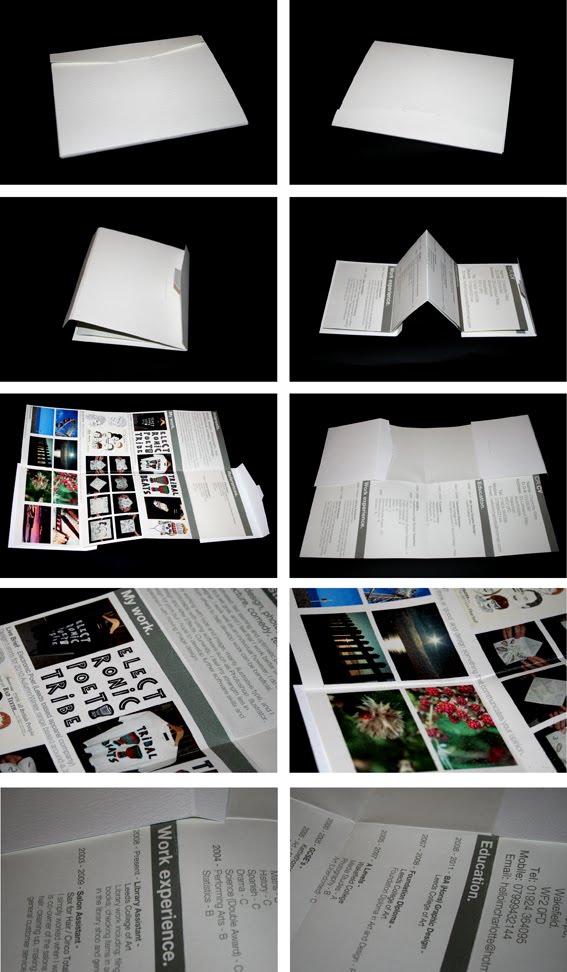
Having looked more at my creative CV and realising I didn't really like it...I spoke to Jayne and she really clarified what it was I didn't like about it (that sounds strange but the points that she made were what I didn't like).
The type needed to be way more consistant...before it was all different sizes and way too big.
Now its a consistant size and a lot more smaller/normal!
The 'inside', where it folded to a full A3 which before showed some of my work and my references...was pretty awful!
It was overwhelming because there was no negative space and the layout was pretty boring. After 're-jigging' the info - putting it all together, I then had a full A3 page to play with, so I wanted to make it look more visually engaging and more like a poster.
I still need to print it out to make sure it works, but just looking at it on screen - I'm a lot happier with it. I think the side that shows my work would be more likely to encourage them to look at a website or ask to see my portfolio, to see the actual pieces - as this just shows a 'glimpse' of what the whole piece is.

It will still fold together in exactly the same way as my mock up did...it will just look better now.
Self...branding?
I still haven't really decided on a 'name' yet, but I played around with the one I used for the Enterprise pitch - Its been my email address for about 4 years so why not!


 I still need to spend some time on it, and although I've put the circle one at the end...Its not the 'Final' by any means. Also, I'm not sure if this circle idea/layout is too over-used at the moment.


 I still need to spend some time on it, and although I've put the circle one at the end...Its not the 'Final' by any means. Also, I'm not sure if this circle idea/layout is too over-used at the moment.
Keaton Henson
...One day, this is what I want.
#1 - Good Website

 The above images show the opening page of the website - when you rollover the wishbone, depending on what side you choos (music/art) it snaps on that side and highlights the word.
Simple, but it made me smile.
#2 - Work in exhibitions....worldwide.
 This is a screenshot of his news page...the most recent entry, that his work is in the London 'Lyrics and type' exhibition.
Illustrative type? Lyrics? This is my dream, and I didn't even know about this exhibition til it was too late.
His second most recent entry is that his work is currently on display in LA...covering the worldwide aspect!
#3 - Client base
 Henson is the regular illustrator for 'Front', a monthly magazine aimed at men. He has also done album artwork for a few bands, designed t-shirt graphics for companies including Topshop and Dropdead and does gig posters/exhibition work.
He's 22...how embarrassing (for me).


Subscribe to:
Posts (Atom)