 This is the 2 sided document that I printed out...I will upload photographs of the final when I have mocked it up :)

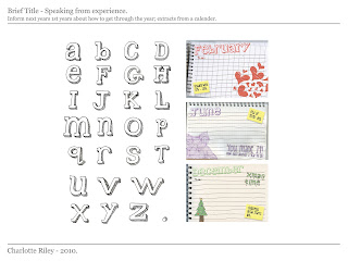
Creative CV
This is the 2 sided document that I printed out...I will upload photographs of the final when I have mocked it up :)
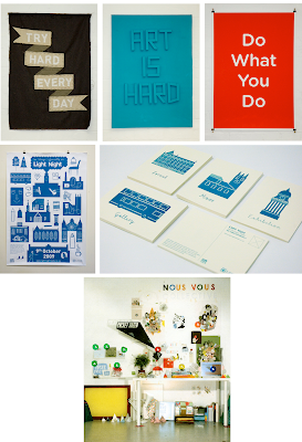
Anthony Burrill and Nous Vous
Examples of the work from the people I recieved feedback from...
Anthony Burrill


Nous Vous

PDF portfolio feedback -
I quickly recieved some feedback from sending out the PDF of work - this surprised and strangely, paniced me.
Anthony Burrill (http://www.anthonyburrill.com/)
Responded withing half hour, said;
- My work 'looks very accomplished'.
- Each project looks different; this can be a good thing and a bad thing depending on the prospective client.
- He really liked the teeth drawings and thought they were funny :D
- 'You've definately got your own style developing'.
- Advice for future - 'Concentrate on developing your own personal style, develop your own visual signature and approach.
- Ended with 'keep up the good work! A X'
Thankyou Anthony!
Nous Vous - www.nousvous.eu
This one paniced me most as they're based in Leeds and Jay from the company emailed back saying he was coming into college the following day...so he would like to give feedback face to face, so he also saw my very small, basic print portfolio.
Feedback and discussion -
-Companies usually want to see about 10 pieces; need more when pitching to clients.
-Make the process become part of the message – context and message. (i.e. for Mail Shot – the message was ‘everything has been said before’ but the folding technique etc. was quite ‘different’ – good to contradict, but could have considered an overused communication method.)
-Audience – is the illustration style etc. appropriate to the audience.
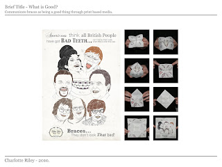
-What is good? Brief – Could have worked more with illustrative type – make a typeface out of teeth.
-The origami piece could have been a mouth.
-Overall – good feedback, liked my work – gave advice on the work that he could see.
PDF portfolio and Email that was sent out
I did have the PDF on here...but then realised, I had the EP tees in, which I'm not supposed to put online, so below are the pages...that aren't the t-shirts.

'Hi...,
I have recently visited your website and I really like the work that you’re producing as a whole.
I am based in West Yorkshire, UK and enjoy working with illustration, type and photography.
I have attached a PDF containing examples of my recent work and was hoping for some initial, professional feedback on the direction I am taking. Also if possible, the details of anyone else that you think it would be appropriate to send it to.
I look forward to hearing from you soon and thank you for your time.
Charlotte Riley.
BA (Hons) Graphic Design,
Year 2
Leeds College of Art.'
Even though I only sent this out recently...it is actually making me cringe just looking at it, I really need to send out better ones in the summer!


All the companies that I looked at...
I've had these printed out in a folder for months...because I thought we were handing in a folder, when I realised we weren't I thought I should put them up here.
When I was making myself believe we 'had' to have a work placement with a design studio, I looked at a few places where I would like to go or where I could go, in terms of location and in all honesty - I wasn't Really excited by any of them.
Below is who I looked at and what I wrote next to them;
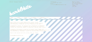
Bark and Bite;
+ In Leeds
+ Good client base
+ Good website
+ Motion graphics
- Maybe Too motion based.
What!?;
+ Diverse range of work
- All men...
- No illustration

Teabag studio;
- Don't stand out

Type in motion;
+ I like the look of the website
- The website doesn't really work very well...or not on my laptop anyway.
Elmwood;
+ Well known
+ High profile client base
- Not sure its really 'me'
- Branding?...

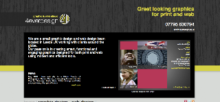
4everdesign;
+ In leeds
- Horrible website
- Don't really stand out
Made by Analogue;
+ Contemporary
+ Good clients
+ Really nice website
+ Get input from freelancers
SBT;
+ Sound enthusiastic
+ List 'illustration' on their services
- But still don't 'stand out' :(
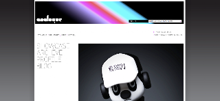
We are boxhead;
+ Nice site
+ Good print work
+ Contemporary
- Seem a bit...up themselves?

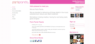
Paris Panda;
+ Really like the site
+ Contemporary look
- Not a lot of imagery
- Hard to find any of their work
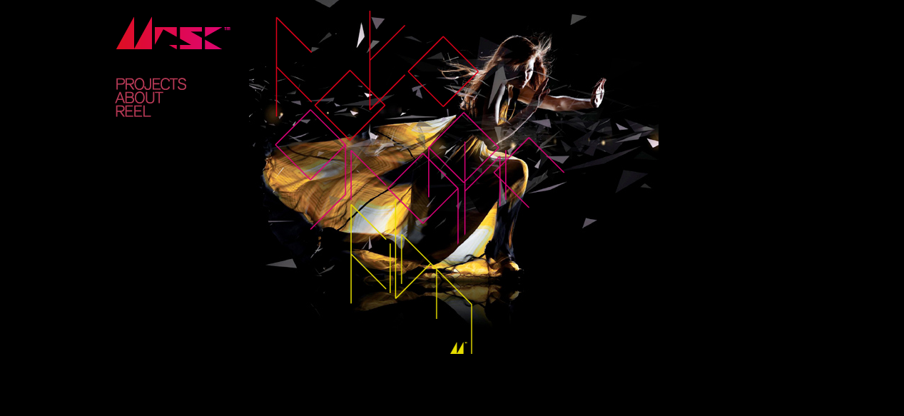
Mask;
+ They've got a studio in Wakefield
+ Really good client base
+ Love the work
- Very digital

Made by pi
- Not sure...

Turnkey;
+ Big group of people
- Marketing/branding.
- Not want I want to do

When I was making myself believe we 'had' to have a work placement with a design studio, I looked at a few places where I would like to go or where I could go, in terms of location and in all honesty - I wasn't Really excited by any of them.
Below is who I looked at and what I wrote next to them;
Bark and Bite;
+ In Leeds
+ Good client base
+ Good website
+ Motion graphics
- Maybe Too motion based.

What!?;
+ Diverse range of work
- All men...
- No illustration

Teabag studio;
- Don't stand out

Type in motion;
+ I like the look of the website
- The website doesn't really work very well...or not on my laptop anyway.

Elmwood;
+ Well known
+ High profile client base
- Not sure its really 'me'
- Branding?...

4everdesign;
+ In leeds
- Horrible website
- Don't really stand out

Made by Analogue;
+ Contemporary
+ Good clients
+ Really nice website
+ Get input from freelancers

SBT;
+ Sound enthusiastic
+ List 'illustration' on their services
- But still don't 'stand out' :(

We are boxhead;
+ Nice site
+ Good print work
+ Contemporary
- Seem a bit...up themselves?

Paris Panda;
+ Really like the site
+ Contemporary look
- Not a lot of imagery
- Hard to find any of their work

Mask;
+ They've got a studio in Wakefield
+ Really good client base
+ Love the work
- Very digital
Made by pi
- Not sure...

Turnkey;
+ Big group of people
- Marketing/branding.
- Not want I want to do

OUG205 - End of module evaluation
The image module has given me the opportunity to develop my image based skills; prior to this I really wasn’t sure which area I preferred as a designer or which I was ‘good’ at but this had made me realise how much more comfortable I am working with image rather than type/layout.
I had two concerns before starting the module, the first being; I thought it would be completely image based i.e. I wouldn’t be able to use type/words at all but I soon realised that type can be image; the second concern was following on from this, if I couldn’t use type at all I don’t know if I’m imaginative enough? Thankfully, my concerns didn’t last long and even though I could use type in my work, I have started thinking more visually and ‘laterally’ (mainly after the 2D to 3D to 2D brief) and realised that everyones work looks different so, in this sense, I feel a lot more confident with my own work and the fact that it doesn’t matter that I aren’t very good character design etc.
An aspect of the module that I liked and had missed was week long or two week briefs. A disadvantage overall that came from this was that, because I hadn’t done it for a while, my development was lacking and I didn’t document it as well as I probably could have done. On the other hand, it was an advantage because I didn’t have enough time to worry about what idea I should develop etc. and I made decisions a lot faster than I normally do; however, at the same time it may have been a disadvantage because I rushed some things. Looking back on the amount of work I have done and some of the resolutions I have done in just a week, it will hopefully encourage me to work faster and not ponder over small things for a long time, in the future.
Although I enjoyed the shorter term briefs, I did still enjoy the final, longer negotiated brief. I knew that I wanted to work more on ‘type as image’ but wasn’t sure where to go from this; after some discussion it was decided I would use Lady Gaga lyrics. At first, I was excited about it and then the joy somewhat drifted away when I was trying to chose lyrics to base my ideas on but once I had made this decision – which took me too long – I was back to being comfortable with the brief. I wasn’t a particular fan of Lady Gaga before and I wouldn’t say this brief made me a fan but it did make me realise I don’t have to base work on things I personally 'love', to enjoy the brief; that would have probably been a bad thing as if I based the brief on one of my favourite artists, I would probably been sick of listening to them after this brief.
Overall I am pleased with the amount and the standard of work I have produced and feel that spending this time focusing on purely image has definitely helped me develop as a designer and will effect my future work in a positive way.
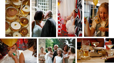
Freelance?...
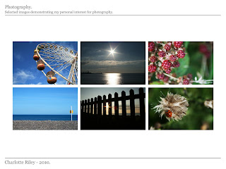
Last year I was asked to photograph one of my mums friends weddings...I definately don't intend to make a living from being a wedding photographer but it was an interesting experience.
Thankfully for me, they wanted mainly 'candid' photography, so I didn't have to stand there telling people what to do as I don't have a particularly authorative personality.
Thankfully for me, they wanted mainly 'candid' photography, so I didn't have to stand there telling people what to do as I don't have a particularly authorative personality.

Subscribe to:
Posts (Atom)