Final Creative CV

Having looked more at my creative CV and realising I didn't really like it...I spoke to Jayne and she really clarified what it was I didn't like about it (that sounds strange but the points that she made were what I didn't like).
The type needed to be way more consistant...before it was all different sizes and way too big.
Now its a consistant size and a lot more smaller/normal!

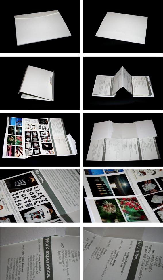
The 'inside', where it folded to a full A3 which before showed some of my work and my references...was pretty awful!
It was overwhelming because there was no negative space and the layout was pretty boring. After 're-jigging' the info - putting it all together, I then had a full A3 page to play with, so I wanted to make it look more visually engaging and more like a poster.

I still need to print it out to make sure it works, but just looking at it on screen - I'm a lot happier with it. I think the side that shows my work would be more likely to encourage them to look at a website or ask to see my portfolio, to see the actual pieces - as this just shows a 'glimpse' of what the whole piece is.

It will still fold together in exactly the same way as my mock up did...it will just look better now.

Self...branding?

I still haven't really decided on a 'name' yet, but I played around with the one I used for the Enterprise pitch - Its been my email address for about 4 years so why not!


I still need to spend some time on it, and although I've put the circle one at the end...Its not the 'Final' by any means. Also, I'm not sure if this circle idea/layout is too over-used at the moment.

Creative CV mock up

Keaton Henson

...One day, this is what I want.

#1 - Good Website

The above images show the opening page of the website - when you rollover the wishbone, depending on what side you choos (music/art) it snaps on that side and highlights the word.
Simple, but it made me smile.

#2 - Work in exhibitions....worldwide.

This is a screenshot of his news page...the most recent entry, that his work is in the London 'Lyrics and type' exhibition.
Illustrative type? Lyrics? This is my dream, and I didn't even know about this exhibition til it was too late.
His second most recent entry is that his work is currently on display in LA...covering the worldwide aspect!

#3 - Client base
Henson is the regular illustrator for 'Front', a monthly magazine aimed at men. He has also done album artwork for a few bands, designed t-shirt graphics for companies including Topshop and Dropdead and does gig posters/exhibition work.

He's 22...how embarrassing (for me).

Creative CV

This is the 2 sided document that I printed out...I will upload photographs of the final when I have mocked it up :)

Anthony Burrill and Nous Vous

Examples of the work from the people I recieved feedback from...

Anthony Burrill

Nous Vous

PDF portfolio feedback -

I quickly recieved some feedback from sending out the PDF of work - this surprised and strangely, paniced me.

Anthony Burrill (http://www.anthonyburrill.com/)
Responded withing half hour, said;
- My work 'looks very accomplished'.
- Each project looks different; this can be a good thing and a bad thing depending on the prospective client.
- He really liked the teeth drawings and thought they were funny :D
- 'You've definately got your own style developing'.
- Advice for future - 'Concentrate on developing your own personal style, develop your own visual signature and approach.
- Ended with 'keep up the good work! A X'

Thankyou Anthony!

Nous Vous - www.nousvous.eu
This one paniced me most as they're based in Leeds and Jay from the company emailed back saying he was coming into college the following day...so he would like to give feedback face to face, so he also saw my very small, basic print portfolio.

Feedback and discussion -

-Companies usually want to see about 10 pieces; need more when pitching to clients.

-Make the process become part of the message – context and message. (i.e. for Mail Shot – the message was ‘everything has been said before’ but the folding technique etc. was quite ‘different’ – good to contradict, but could have considered an overused communication method.)

-Audience – is the illustration style etc. appropriate to the audience.

-What is good? Brief – Could have worked more with illustrative type – make a typeface out of teeth.

-The origami piece could have been a mouth.

-Overall – good feedback, liked my work – gave advice on the work that he could see.

PDF portfolio and Email that was sent out

I did have the PDF on here...but then realised, I had the EP tees in, which I'm not supposed to put online, so below are the pages...that aren't the t-shirts.


'Hi...,

I have recently visited your website and I really like the work that you’re producing as a whole.

I am based in West Yorkshire, UK and enjoy working with illustration, type and photography.

I have attached a PDF containing examples of my recent work and was hoping for some initial, professional feedback on the direction I am taking. Also if possible, the details of anyone else that you think it would be appropriate to send it to.

I look forward to hearing from you soon and thank you for your time.

Charlotte Riley.
BA (Hons) Graphic Design,
Year 2
Leeds College of Art.'

Even though I only sent this out recently...it is actually making me cringe just looking at it, I really need to send out better ones in the summer!

The 'dry' CV